|
The name of my restaurant is going to be Flux bakery. It’s going to be located in Times Square, New York. This is going to be a bakery, so we sell cakes, cupcakes, pies, and shakes. My restaurant is going to be a big tourist attraction and many of the local teenagers come as a hangout spot. I would categorize it as a family place. Its a very friendly environment and it’s well known around the world. I would have Specialty shakes such as Smores explosion or Grandma Mays Apple pie, even customize cakes. I would place the pictures of the dishes on the side of the menu and the names of them in the middle. I will take pictures of pies and drinks to use on my work. I feel people will like my proposed menu design.
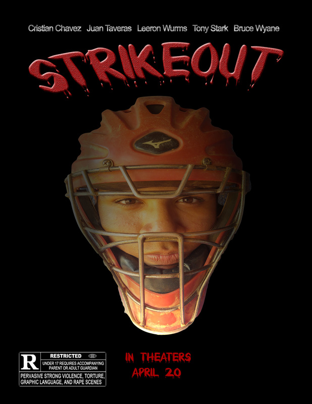
i will advertise an action movie. I chose this because i feel that i can create an interesting cover poster with this genre. My intended audience would be teenagers and nerds. The intended plot is a group of friends decide to be super heroes but fail miserably. The title is going to be… The leading actors are going to be Cristian Chavez, Aaron Mccune, and Sam Gonzalez. I will make it obvious because I’m going to line up the characters and show all the main characters on the poster. I intend to take these images at the baseball field. I plan on using the lighting effect and the blur filter to create an action feeling. I want the poster image to send out the most because its going to give a clear understanding of what the movie is about. I want them to see that it was a great and iconic movie.
Based on the poster the movie falls under the action and sci-fi category. Its this character because theres light-sabers and the Millennium Falcon which is futuristic.The movie advertises Star War: The Force Awakens. The movie genre is action and sci-fi. The leading actors are Daisy Ridley, John Boyega, Harrison Ford, and Adam Driver. The movie was released on December 18, 2015. The poster is photographic, i think the reason why the designer chose a photographic image because It gives it a more realistic aspect rather than a cartoonish feeling. The intended audience for the movie is teenagers and adults because its a continuation to a classic film in the 70s. What helps me determine that is kids from the 70s grow up watching this and pasted it down to their children which gained popularity. Now that a new version is announced people of all ages are flooding in to see it. THIS MOVIE DOES NOT HAVE A TAG LINE. 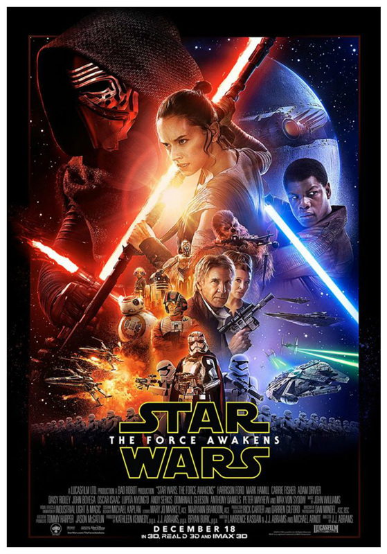 Filter challenge 1: I used the oil paint filter to make the Eiffel tower look cartoon like. i edited the strokes to make it look very detailed and well painted.
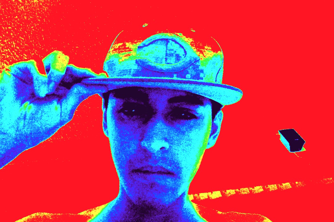
filter challenge 2: I used the liquify filter to edit the photo in a way that the Eiffel tower looks like it is wavy. Filter Challenge 3: I used the pixelate and oil paint filter to make the picture stand out more. I also used the brightness and contrast to make the scene look like it's a night. Filter challenge 4: I used the blur filter to focus all the attention on the Eiffel tower. Filter Challenge 5: I used the lighting effect/ render to make the image look out of this world by having a green sky and a yellow light acting as the sun rising. 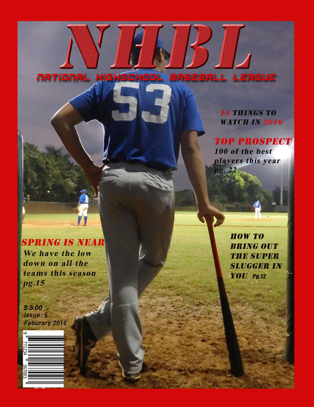 The theme that i choose for my assignment was sports themed. The name of my magazine is NHBL (National High school League). The theme is sports so I created a high school baseball magazine, each cover line relates to the topic of sports. I used an image of a teammate facing the field with a bat. I took this picture during a game to capture the field in the background. I selected this image because it relates to my magazine which is high school baseball.My target audience is high school baseball students and colleges around the country. The cover image and the cover line appeal to my target audience because, it talks about things that would interest not only high school baseball players but college scouts.
All did for my cover image was resize it using free transform. I only used the free transform tool. I used in total 3 different fonts: ESPn, times new roman, and stencil. I used the outline layer style to make the type more legible. So i made sure that all the captions and cover lines are evenly spaced out. Also I didn't cover any of the images focal points. I was very satisfied with my work. I would use the clone tool to take away the players in the background It is important for the magazine to be consistent with design because the goal is to attract the audience to buy the magazine in the article the author says that the basic concept of typography hierarchy is to create a readable structure within an image. Authors might sketch a magazine cover layout on paper to make a rough draft or an idea of what their cover might look like. The title must remain the same throughout the magazine. It has to remain the same because the title must be recognizable. Something that stood out was theres website that you can go on to get pictures freely and use for magazine covers if you are unsure of what to use as a cover photo. I can’t incorporate this into my magazine cover but its interesting that if you need help with a cover idea theres sites that help you. The theme of my magazine cover is going to be school sports related. The title is still a work in progress, the type of articles that are going to be featured will be “How to release the All-Star within.” and “Tips to being a successful student athlete”. The image that I envision on my cover is a pitcher throwing a baseball. I will obtain this photo by using a fast shutter speed to capture the motion of a pitcher throwing a baseball.
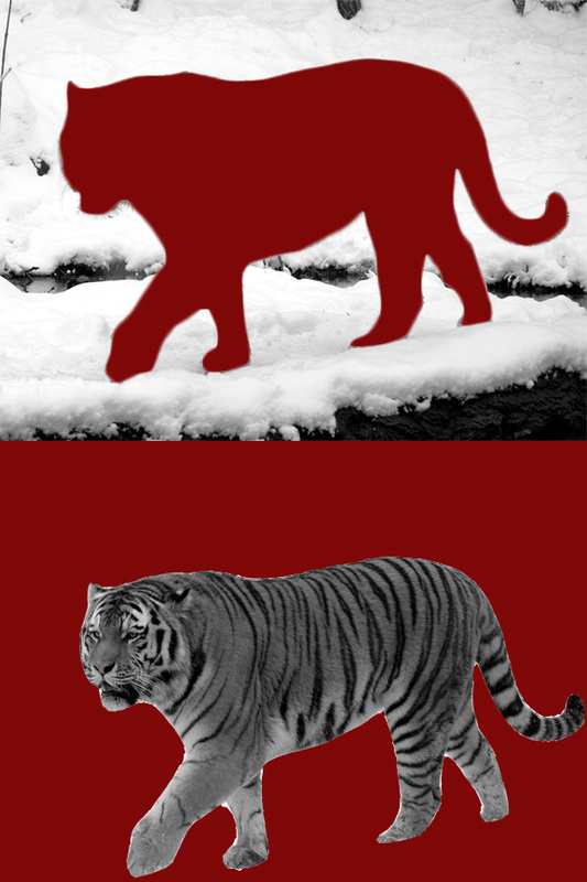 The difference between negative space and positive space is, negative space is the background of the photo its purpose is forest the viewers eyes. While positive space is the main focus of the photograph. It’s important for a designer to have negative space because if theres too much going on in the photograph it will lose the viewers interest confusing them as to which is the main focus of the photo. The negative space in my first edited image is the red tiger because the main focus is the back ground, positive space, giving the viewer a “rest” for their eyes. The negative space in my second image is the red background. The positive space in m imagine is the tiger. I feel that the second image is better negative space because you can clearly tell what the main focus is and what is being portrayed, while the first imagine is just the snowy background.
|
AuthorCristian Chavez is a senior at Plantation high school. He would like to work for Fox Sports one day for the media department. He enjoys going mudding with his mom's Jeep. Archives
May 2016
Categories |
 RSS Feed
